You may be wondering: how exactly does Rhumbl figure out how to arrange nodes? Before reading this section, it's recommended to first review the concepts of entities and relationships.
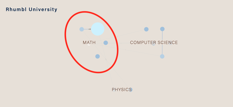
Firstly, unlike in traditional network visualization, Rhumbl groups your nodes together via the existence of parent relationships. For example, in the example below, the node-type entities representing Subjects are grouped under the group-type entity Math. Math is also an entity, but it is a group-type entity.

Nodes that sit under the same parent will always be clustered.
Layout Fact #1: Nodes under the same immediate parent are clustered together.
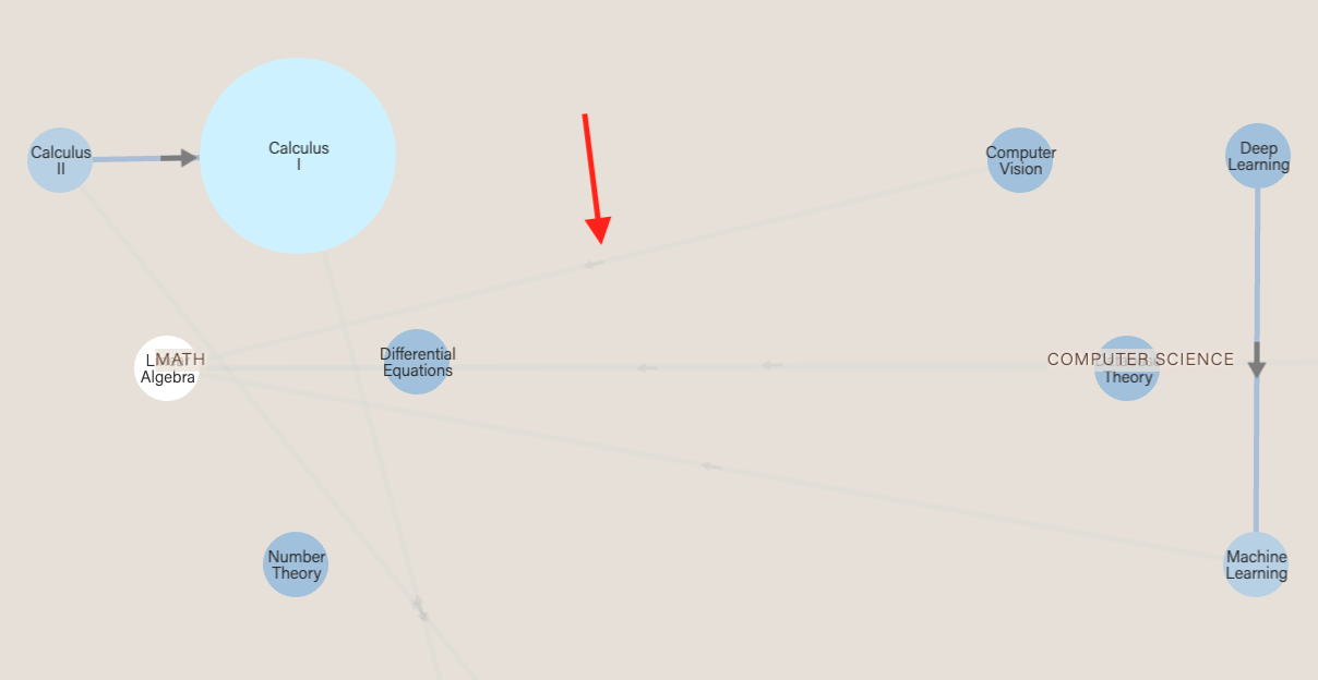
Next, notice that certain edges seem much fainter than others. Specifically, edges that are between two nodes belonging to different parents appear fainter. This helps to keep the visualization cleaner looking.

Layout Fact #2: Edges that crosscut parents are much fainter than edges within the same parent.
Finally, you may be wondering how clusters themselves are placed. Groups with nodes that have the most number of edges are placed in the center. This is because groups with nodes with high numbers of edges are almost always the most important and most interesting, and thus should be placed in the center.
Layout Fact #3: Groups that have the highest numbers of edges are placed in the center.
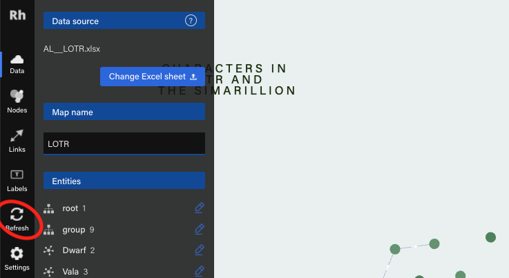
By default, when you add new relationships or entities in Graph Studio, the layout does not change. This is so you can clearly see what you added. To refresh the layout, click the icon in the leftmost menu bar. The more nodes you have, the longer Rhumbl needs in order to compute a new layout, so please be patient! We are actively working to make this more efficient.

Can I manually adjust the position of certain nodes? Unfortunately, no, for the time being. This is a request that we get often, and we are still actively working on this feature. Check out our upcoming features.
Pro tip! Adjust your styles, colors, and data first with a smaller sample of your map. Then, when you're ready, upload your big map. This way, you can quickly experiment and iterate on styles without waiting for layout to re-compute every time.
When making a big map, we need to be prepared to wait in three areas: 1) load time, 2) run time and 3) layout time.
Load time: The amount of time users spend waiting for the map to load. While we are constantly making incremental adjustments to improve load times, this is predominantly a function of how fast the user's internet connection is. It's equivalent to streaming music or videos — whenever you're downloading a large amount of data, no matter how good the service is, there is some amount of waiting.
Run time: How smooth and snappy the map feels when you're interacting with it. This is dependent on our efforts and also on the browser you're using. Chrome feels the smoothest, with Safari and Edge coming in at close second and Firefox coming in last.
Layout time: How much time it takes to generate the layout when you're creating the map. This is dependent on our efforts and your internet connection.
With all three aspects, the bigger the map, the longer things take. We've compiled a table below from testing to give you an expected time frame based on how big your map is.
Last updated: July 20, 2020. Assumes you are on Chrome, have high-speed internet connection and are located in the Americas or Europe.
| Load time | Run time | Layout time | |
| < 1000 relationships | ~2 seconds | Snappy | ~5 seconds |
| < 2000 relationships | ~5 seconds | Snappy | ~12 seconds |
| < 4000 relationships | ~5 seconds | Snappy | ~3 min 30 seconds |
| < 6000 relationships | ~8 seconds | Snappy | ~8 min |
| < 8000 relationships | ~20 seconds | Zooming is laggy; otherwise snappy | ~14 min 20 seconds |
| < 10000 relationships | ~30 seconds | Zooming is laggy; otherwise moderate | ~26 min |
From this table, we see this important fact: Layout time rises dramatically with the number of relationships.