Guide to graph visualization tools and how they're different
Aug 16, 2020
When you're looking to visualize your network data, the sheer number of tools out there can be really confusing. Which one to pick?. But not all tools are alike. In this article, we'll talk about the general categories of graph visualization tools that are out there: network diagramming tools, graph visualization code libraries and network visualization tools. We'll show you which tools are the right ones for the job.
Category 1: Network diagramming tools
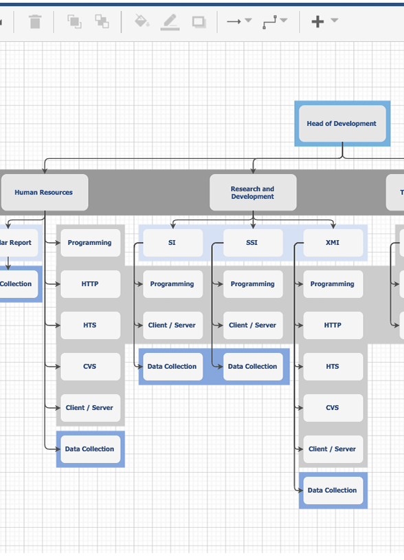
Quick, when you think of the word “diagram”, what do you think of? If you answered along the lines of “drawing boxes with arrows and lines”, you'd be quite right. In this category are tools that focus on you drawing the shapes and lines of your data, rather than on the data itself. While these work for one-time charts that you'll never use again, you wouldn't choose these to draw network graphs of data that you'd want to share, keep updated, etc. Here's an example:
-
TLDR: Web-based, you draw boxes and edges to make a network chart
It's actually a nifty little tool, good for quick, one-off diagrams and charts. It's like Powerpoint — you draw boxes, connect them to each other by drawing lines between them. It even connects to Google Drive, and lets you export in multiple formats.
Use it if you just want to make a quick chart. Don't use it if you have lots of data, if you expect your data to change, or if you ever need to get that data back and draw the network in a different way.
Category 2: Graph visualization code libraries
Graph visualization code libraries are packages of code that let you write code to more easily generate graph visualizations. They don't absolve you from writing code; on the contrary, these code libraries actually require a fair amount of coding expertise. A couple examples of such code libraries:
-
TLDR: Open-source, steep learning curve, uses pure Javascript
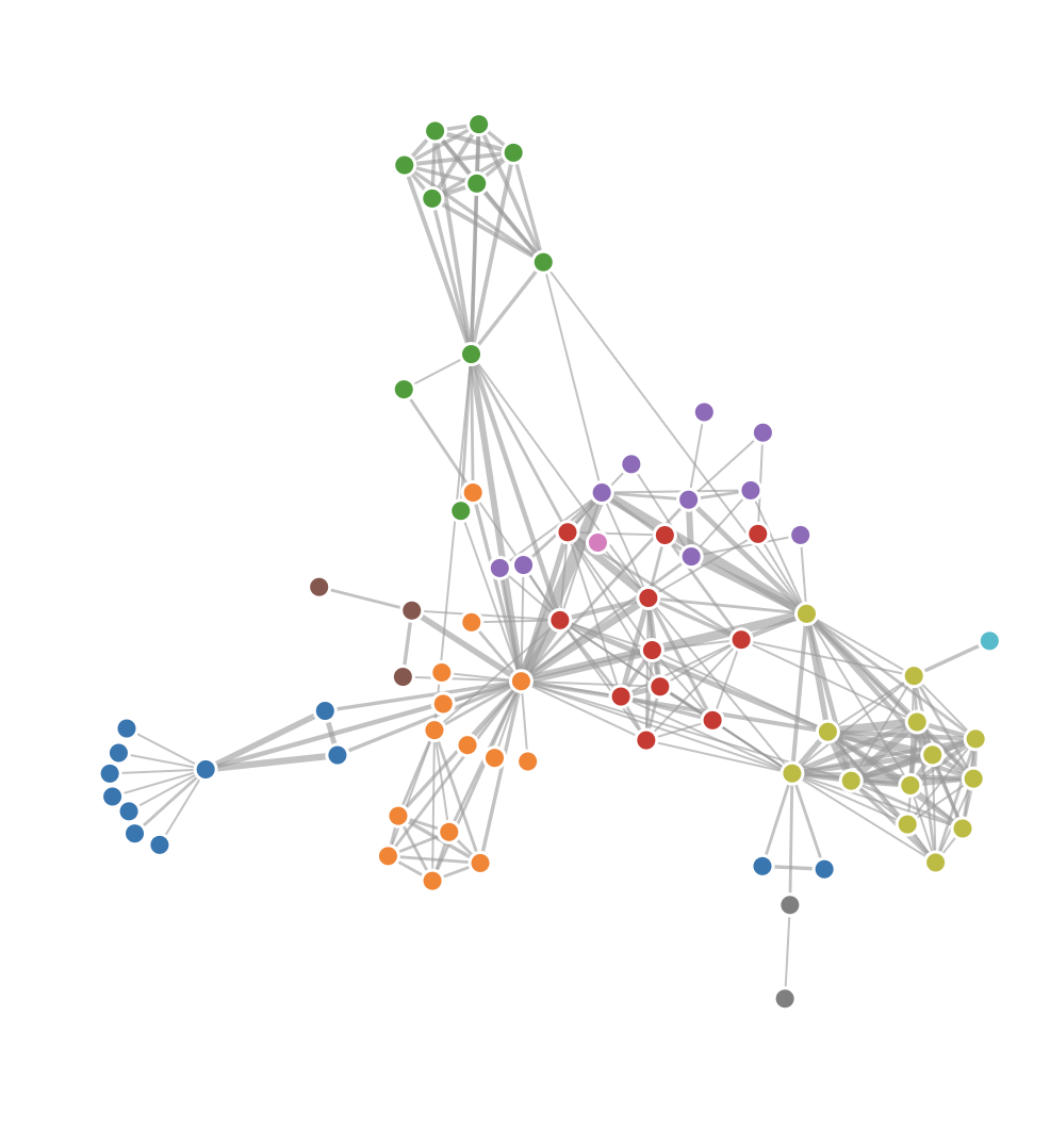
Ah, d3, the king of visualization code libraries. D3 is well-known in the web world for being the canonical library when you have large amounts of data and want to turn it into an online data visualization. It has a package for physics-based network layout.
If you decide to use D3 — be warned — it has a steep learning curve and a unique way of thinking about joining data to visualizations.
-
TLDR: Open-source, uses DOT language, intense math behind its layout algorithms
GraphViz is one of the oldest open-source graph visualization tools out there. You write data in the DOT language, and it outputs diagrams in PNG or vector formats. The hard thing is: you need to take some time to set up and massage your data into the right format.
GraphViz is really intense when it comes to graph layout — its creators wrote math papers on how to position nodes and edges optimally. This tool probably is one of the most sophisticated when it comes to automatic graph layout.
Category 3: No-coding network visualization software
This is the category that Rhumbl resides in. These are graph visualization tools that produce network visualizations from data, so you don't have to manually draw things, but they also don't need you to write code. Choose this category if you want a data-driven network graph, but don't want to waste time getting dirty in code. An example:
-
TLDR: Open-source, Java dependency, can handle big data sets
Gephi is an old-school graph visualization software. You download it, and your computer needs to have Java installed. The good thing is — it can handle hundreds of thousands of data points (if your computer has enough RAM).
There you go — 3 categories of network visualization tools, 3 distinct use cases. For a more comprehensive list of tools for graph visualization, check out this Medium article.


