Visualizing contact tracing with network diagrams
Sep 13, 2020

One of the tools public health workers are employing in the fight against COVID-19 is contact tracing. Contact tracing is the process of tracing all the people with whom a person has had contact with, in order to warn those people that they've had contact with a COVID-positive person. For example, Susan had lunch with Bobby, who then visited his aunt Sally, who in turn went to the hairdresser George. This kind of relationship mapping is a perfect case of when you want to use network visualization to help in contact tracing.
Contact tracing using a network model
When doing contact tracing, the network model is pretty simple — a person is a node. Here comes the cool part — because the concept of time is important, e.g. it's important to see if Bob visited his aunt before he met with Susan, we're going to draw a directed relationship between two people, e.g. from Susan to Bobby, then from Bobby to Sally. This is going to let us use the network visualization to easily see future and historical paths, as we'll see later on.
For each person, we're going to attach a few more attributes of interest:
- Phone number
- Has been contacted
- Is symptomatic
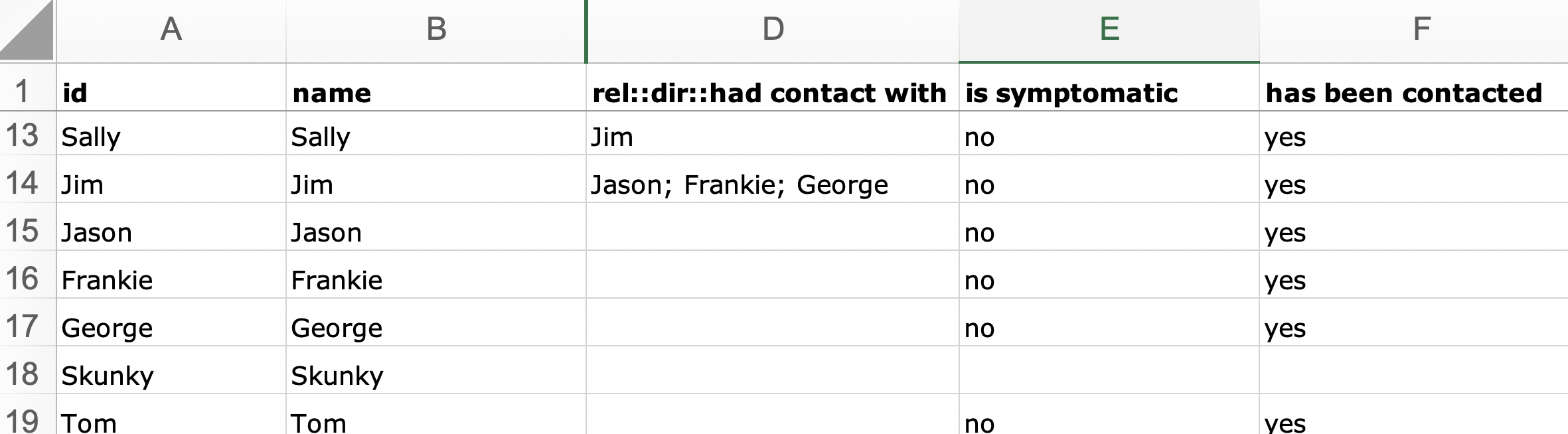
Often contact tracers use excel to keep track of people and information on those people. We're going to use an example data set of around 30 people, demonstrating how the virus spread from person to person from a public event. Download contact tracing excel spreadsheet. All names are fictional.
The network visualization for contact tracing
Okay, so we've got our spreadsheet. We'll upload it to Rhumbl and check out what we get:
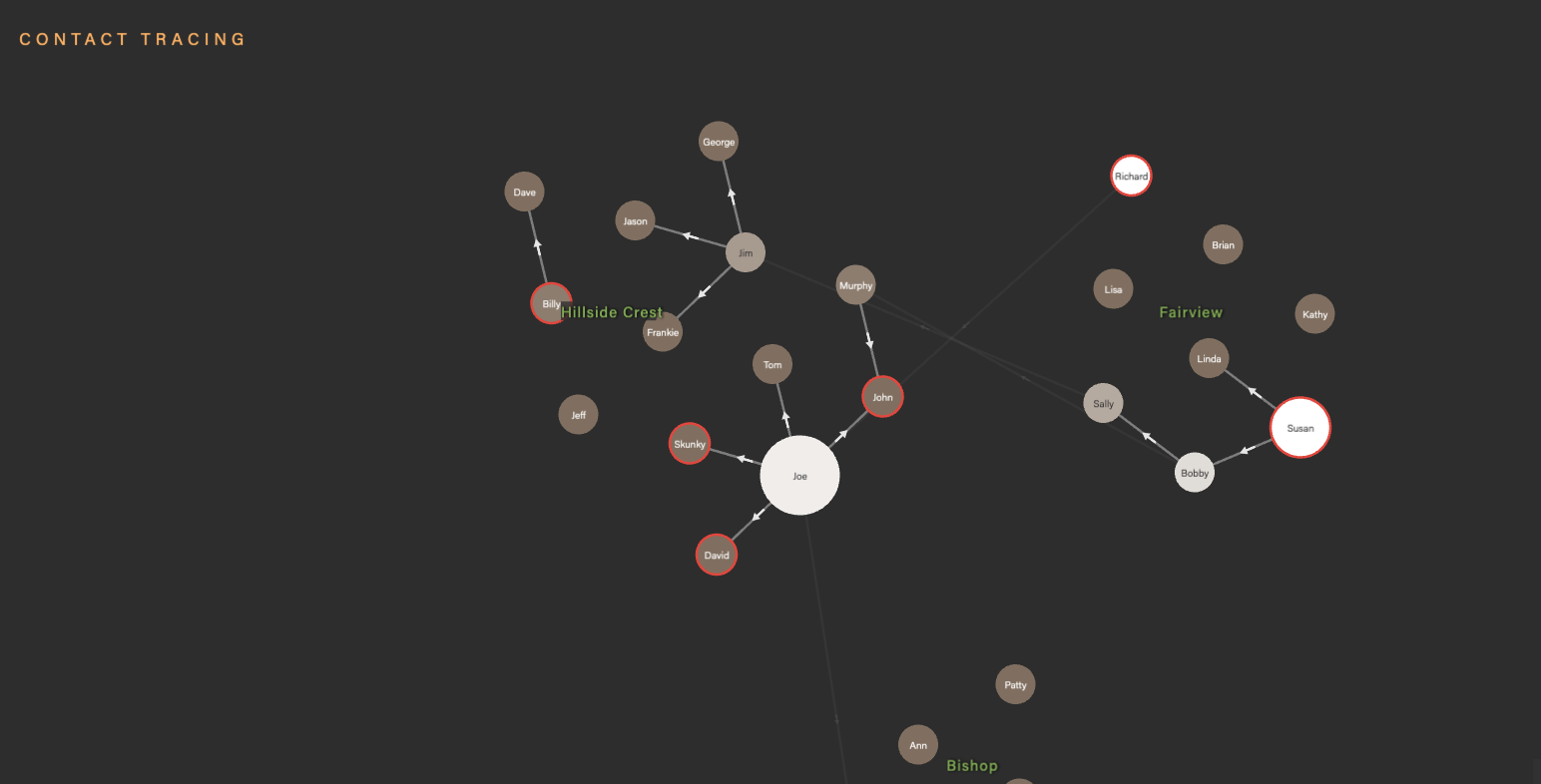
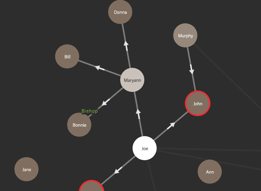
Note that some of the nodes are brighter than others. These are the nodes that represent the superspreaders — people who spread the virus to a bunch of other people. How did we do this? We do this by selecting the Outgoing degree (1 depth) option for Color nodes:

Also note that some of the nodes have red outlines. These outlined nodes represent the people who still need to be contacted. This is done in the spreadsheet by setting the stroke outline stroke:: to red in the spreadsheet.
Most importantly, notice how we can analyze the flow of infection by mouseover'ing persons of interest. In the leftmost image below, the mouseover setting is set to Outgoing degree (1 depth); in the middle image, the mouseover setting is set to Outgoing degree (all depth). Because we've defined a directed relationship from one person to the next, this gives us a powerful way to visualize the spread of coronavirus over time. Alternately, by setting the mouseover pathways to Incoming, we can trace the coronavirus backwards in time to see who may be patient zero.


You can check out the full interactive contact tracing visualization here, with the accompanying data spreadsheet here.
For those of you who are looking to make your own visualizations, we have a free 14-day trial account (no credit card needed) that you can check out pricing and sign up here.