Top 5 design principles for network visualization
Aug 1, 2020
In an earlier post, we talked about the 2020 trends of network visualization. One of those trends was that of better design. Let's learn how to make our network visualizations look better and function better. Here are top 5 design principles for network visualization, with before and after examples.
Design Principle 1: Break down your data
Wait, but this is an article about design, you said! It is, but form follows function. The first step to making awesome graph visualizations is to have awesome data. One of the most common mistakes we see in graph visualization is that entities are not broken down enough to finer-grained entities, and relationships are worded too vaguely. This leads to only a handful of entities, which doesn't look good. But more importantly, this leads to a poorer user experience of your network map because the map doesn't seem useful. Consider the example below:
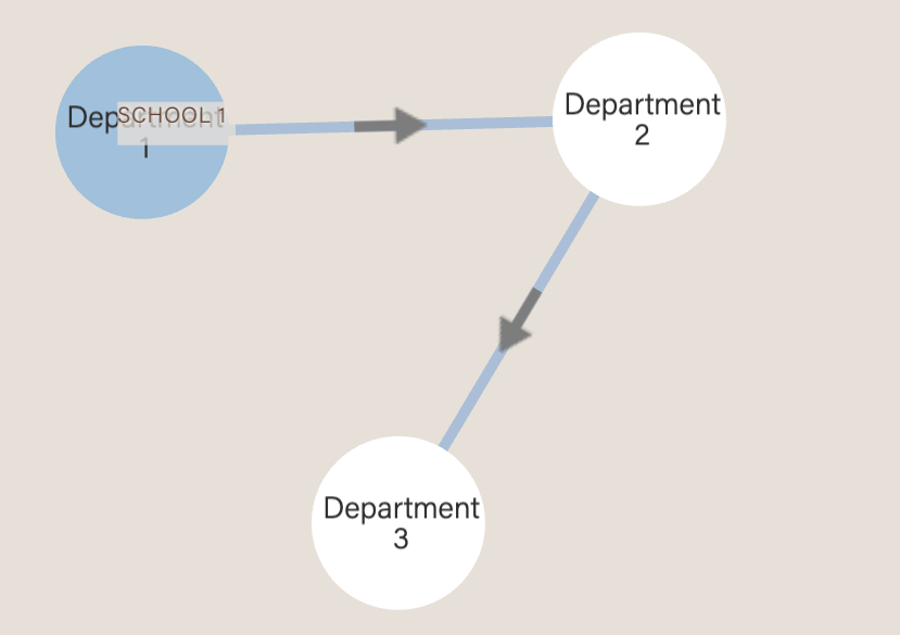
Before: Vague relationship between coarse-grained departments
After: Clear relationship between fine-grained learning objectives
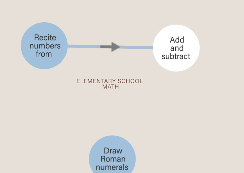
In the above example, it's not really clear what the left picture means. What are the arrows pointing from Department 1 to Department 2? How do they relate to each other? These problems occur because the entities are too coarse-grained. In the picture on the right, we see an improved example where entities have been broken down into finer-grained statements of learning, and it's clear that the relationship is describing prerequisites.
This also applies to relationships. Be specific in the wording of your relationships, e.g. "is related to" is vague. Don't do that. Instead, be specific: "is influenced by" is better; "is a protege of" is even better.
Summary: Fine-grain your entities + specifically-worded relationships ⇒ the more rich and informative your graph visualization.
Design Principle 2: Tone down saturations
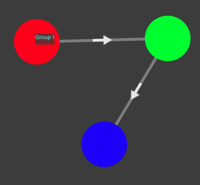
Color can be described using 3 aspects: Hue: the name of the color like red, green or blue; Saturation: the intensity or how vivid it is, and Luminance: how bright or dark it appears. This way of describing colors is known as HSL. Let's see what happens when we crank up the saturation:
Before: Maximum saturation
After: Still bright, but not maximum saturation
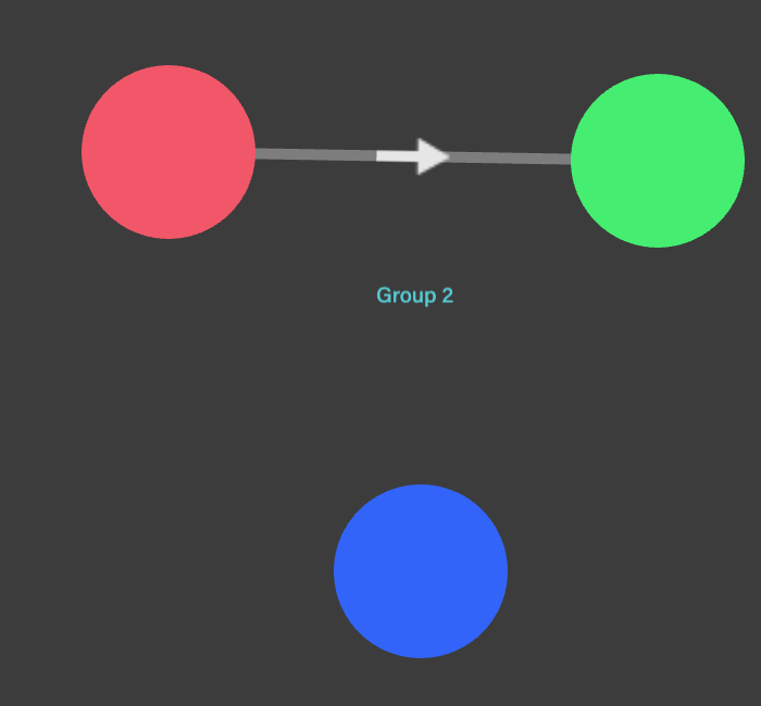
In graphic design in general, a rule of thumb is: Maximum saturation is maximum ugliness.
Just think: nothing is pure black (#000000) or pure white (#ffffff) in real life. If you want to use an intense color, you still can, but just tweak the saturation. How to do this? You can easily use an online color tool, e.g. Paletton.
The same rule applies for edges: lower saturations on edges too. In fact, we'll go even further to suggest that unless you really want to emphasize a few relationships, you should make all your edges a muted gray. Or you risk your graph visualization looking like busy multi-colored strands of pasta.
Design Principle 3: Vary node sizes and colors
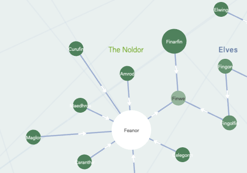
Variety is the spice of life. The third design principle in network visualizations is that you should vary the size and colors of nodes, and the stroke thickness of edges. A graph visualization where nodes and edges are all exactly the same is boring. Take a look:
Before: Same nodes and edges
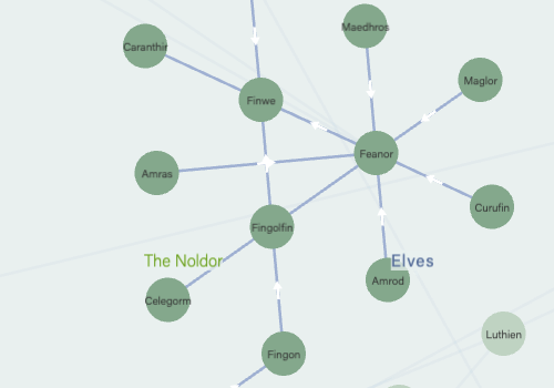
After: Different sizes of nodes and thicknesses of edges
Try these ideas on how to size and color nodes and edges:
- By how important it is. It's a no-brainer that the bigger something is, the more attention-grabbing. If you have a node that you want to highlight, make it bigger or color-contrasting.
- By their nodal degrees. The more connected the node, the bigger or color-contrasting it should be. This draws attention to the most highly-connected nodes.
- Vary edge thickness by the strength of a relationship between two nodes. The stronger the connection, the thicker the edge should be.
Design Principle 4: Practice good typography
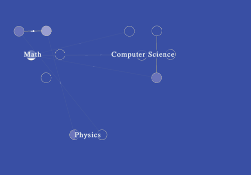
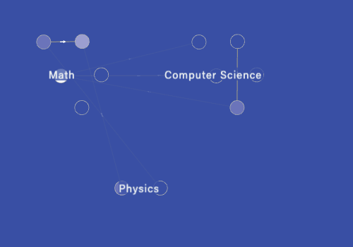
Good typography always matters in design, but in network visualizations, it's critical. Why? Because you only have a tiny bit of space for labels, and you want labels to show the text in the best possible way. Bad typography makes users' eyes squint:
Before: The serif Times New Roman makes the labels hard to read, especially at small sizes
After: Much easier-to-read labels with a web-friendly typeface, Verdana
Use these tips to improve typography in your network visualizations:
- Avoid serif typefaces: Serif typefaces can be really hard to read, especially at small sizes and when you have a bunch of nodes and edges. Opt for sans-serif typefaces with wider letterforms, such as Verdana.
- Use differing font weights and styles: Make your network visualization more interesting by using different font weights and styles. For example, labels on nodes could have a heavier font weight, while other labels could have a lighter weight.
- Shorten node labels: Whenever possible, you should avoid the "text overhanging node" look — this is exactly what it sounds like, when the text is too long to fit within a single node. Overhanging text looks tacky and unpolished; try to make your node labels more concise, or your nodes bigger.
Design Principle 5: Employ user-driven movement
Nodes shouldn't dance around for no reason. Although you think it looks cool, it leads to a super frustrating user experience as the user tries to mouseover or click on one, and misses because it's wriggling around. Check out these GIFs:
Before: Random animation even though the user has taken no action
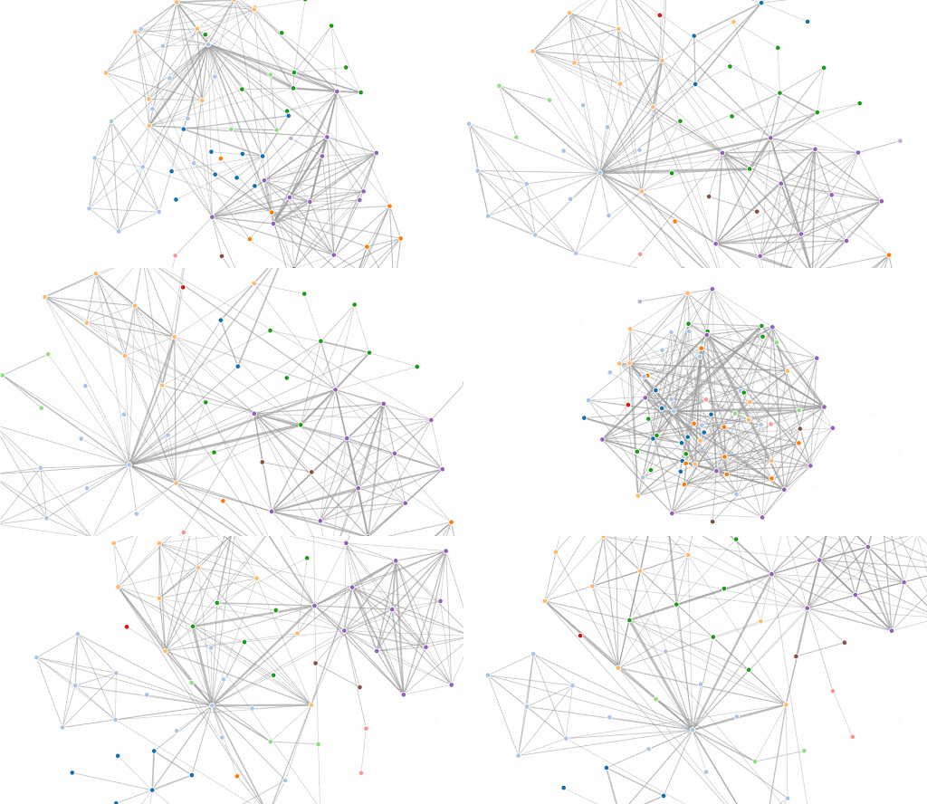
After: Removed beginning animation and just present the static network map
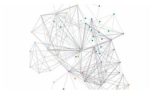
We know, we know. But it looks cool, you say. But it's not practical. From a user perspective, it's disconcerting. So skip the unnecessary animation, and put that to good use where it counts. Here are situations when you do want to have animation:
- Clicking or hovering: Note that this shouldn't make nodes move, because a click or a mouseover means that the user expects to reveal or find out something. Rather, have animation that reveals something, like a text box or more information.
- Adding a node or an edge: This is where nodes moving make sense, because you've just changed the data and therefore, shape of the network.
- Refreshing or changing the layout: Again, this makes sense here, because the user has just explicitly taken an action to change the layout of the network, and thus the network map moving and animating is expected.
So, remember to keep these 5 design principles in mind the next time you make a graph visualization. Happy mapping!

