The 2020 guide to network visualization and relationship mapping
Jul 28, 2020

It's 2020. Techniques and technologies in drawing network data has improved so much beyond the days of us drawing diagrams in Powerpoint. General data visualization has been pretty good with keeping up with the most recent web technologies and design trends, but network visualization is only just starting to catch up with best practices.
Why? Because network visualization is hard. If you think about it, drawing a bar chart is much easier to draw a bunch of nodes and edges connecting them. But with more and more people realizing how useful network visualizations are, and that they're really the same thing as relationship mapping, more and more best practices are being adopted.
What are these best practices? These are trends that aren't going anywhere, and that will be expected as baseline standards going forward.
Trend No. 1: Data-driven network visualizations
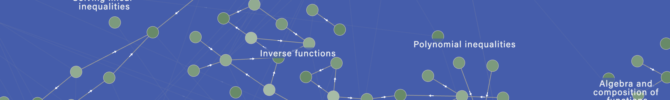
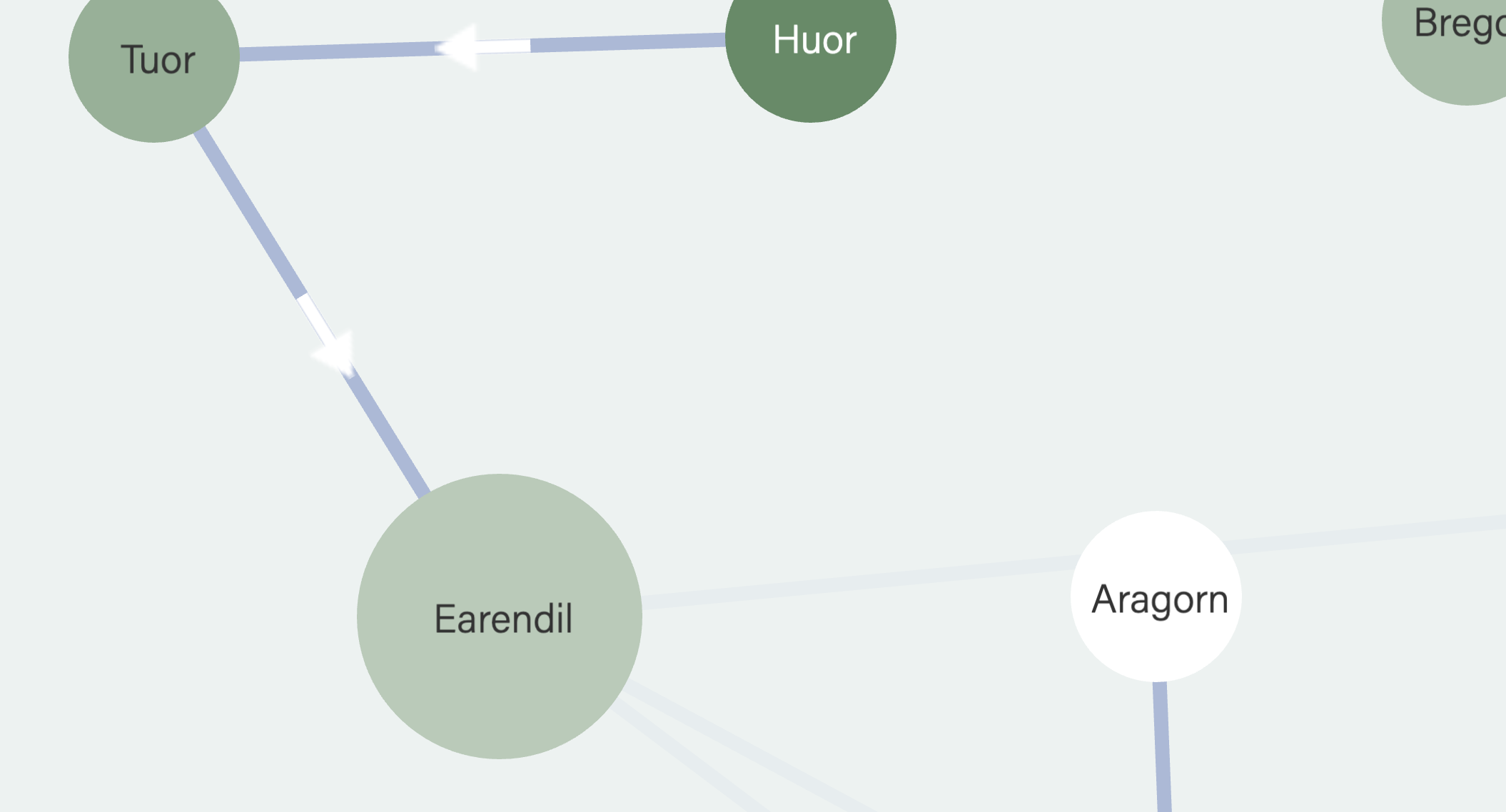
What is a data-driven visualization? A data-driven network is one where there is actually *data* behind the drawing. When you draw a diagram in Powerpoint, there's no data behind it &mdash it's just a graphical drawing. Conversely, when you draw a chart in Excel, you select the rows and columns of data, and the chart gets drawn from the data.

This sort of data-driven approach has been pretty common since Microsoft came out with Excel. But, Excel charts have always been looked at as somewhat ugly. But in the past decade, we've seen some pretty awesome tools that let people create really nice-looking visualizations from punching in data, like Tableau, or Adobe Express, and even Excel has really upped its design game.
Now, this data-driven trend has finally caught up to network visualization. No more are the days where you draw circles and connecting lines as a graphic. Sure, that approach is fine for a few nodes. But if you are looking to seriously map relationships in a meaningful data set, you're going to want a data-driven way of creating network visualizations. There are a bunch of advantages to this method of graph visualization:
- It's scalable: It doesn't matter if you have 5 nodes or 500 nodes, or if you change relationships to point from one node to all nodes, you don't need to worry about rearranging nodes and edges on the screen. Think of what a nightmare it would be to have to manually re-arrange your edges and nodes every time you change your data.
- Analytics: If you have just a plain graphical diagram, you can't do analysis on it. But if you have a data-driven graph visualization, you can do all sorts of graph analytics. You can ask: how many nodes do I have? What is the most connected node? Do I have any weak links? Do I have any circular loops? What is the longest path? If I start at one node, can I reach another node?
Trend No. 2: Interactive network visualizations
Remember the 90s? Remember when street maps used to be on paper? Or remember the days when, before you embark on an unfamiliar journey, you first printed out Yahoo maps and directions? That's what non-interactive network visualizations feel like.
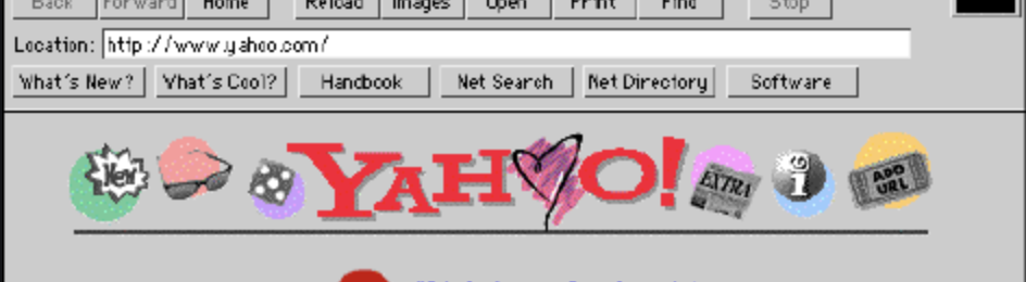
Taking the analogy of modern interactive street maps and applying them to network visualizations, we can see how important this interactivity is. Just like on street maps, we want to be able to pan around and explore all corners of the visualization, without being constrained to a single piece of paper. We want to zoom in to see little details. We want to be able to click on nodes, and have more info show up. Or mouseover on nodes and edges, and see little extra details.
This level of interactivity is made possible by the web getting faster and faster, and our devices being more powerful. Interactive network visualizations are here to stay.
Trend No. 3: Material design and flat design trends applied to network visualizations
Ah, we as designers remember the days of bad skeuomorphic design, the rise of flat design, where nothing looked clickable and the latest material design trend.
Just as general data visualizations got better and better looking, network mapping tools are starting to pay more attention to good design. That means paying attention to typography, tints and saturations of colors, principles of progressive disclosure applied to graph visualizations, etc.
Specifically, we see these techniques for coloring network visualizatons:
- Colors and saturation: Maximum saturation colors is almost never used. "Black" is almost always never #00000, but instead #333333.
- Circles, not rectangles: Diagrams using rectangles for nodes, the shape reminiscent of the 1990s, give off a distinctly old-style look. Circles of all different shapes and sizes representing nodes are now dominant.
- Times New Roman no more: With so many free awesome fonts available, typography in graph visualizations is leveling up. Gone are the days of using system Arial and Times New Roman. Network visualizations these days are using typefaces that pair well, and using different font weights for displaying different levels of information hierarchy.
For those of you who are design nerds, read our post here on how to make your network visualizations look better.
So that's it! These are the three biggest trends in network visualization that aren't going away anytime soon. We expect them to be more like baseline standards going forward. Where can you find tools that generate such graph visualizations? That's another post for another day.