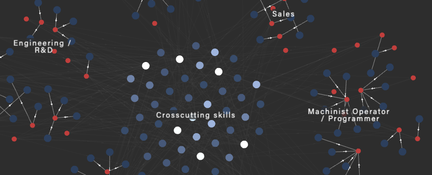
Hello! Graph visualization world.
Jun 15, 2020
This post marks our first ever blog. Why did we decide to launch this blog? As we are constantly releasing new features and making updates to Rhumbl, we decided to have a place to announce feature releases. We will also be posting articles and tidbits on graph visualization. To start with this first post, we'll be talking about who Rhumbl is for and why use Rhumbl for network visualization.
Rhumbl was first created as a tool to help researchers author highly-connected data. What do we mean by highly-connected data? Data where you have a bunch of connections amongst things. This sort of data is difficult to edit because it's tough to visualize these connections. The longer the connection chain, the harder to visualize. This type of data is often modeled in a network form.
That's when we came up with Rhumbl --- to help visualize these connections as we're editing them. We wanted to see how nodes are affected if you add an edge. Or what nodes are the most connected to other nodes.

We wanted to make Rhumbl easy to use, versus all the other graph visualization software out there. Many tools out there — great as they are — simply require too much code, or configuration, or downloading software onto your computer. We wanted people to be able to edit right there in the browser. Rhumbl is still pretty young, only a few years old. We rely on the feedback of our users to tell us what they want, or what's not working.
Thanks for your continued support!

