How to do educational mapping
Aug 23, 2021

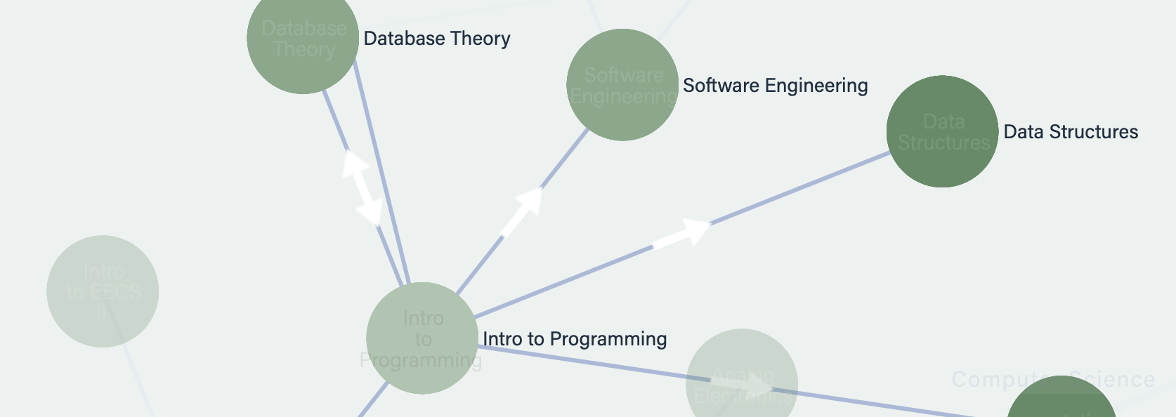
Educational mapping is an extremely overloaded term with many different meanings. When we talk about educational mapping, we're talking about taking your data, chunking it into discrete entities, and drawing relationships between those entities. That's an abstract framework, but a couple specific examples of educational maps are curriculum maps (where you have subjects and you draw linkages amongst those subjects), and outcome maps (where you have learning outcomes and you draw linkages amongst those outcomes.)
Different educational maps for different folks
The specific type of educational map you need depends on what you hope to achieve. If you hope to document and show connections across different departments, then perhaps all you need is a curriculum map with subjects as nodes, and the edges between nodes are prerequisite relationships amongst the subjects.
An example of such a curriculum map is the Massachusetts Institute of Technology curriculum map showing subjects across all of MIT's departments.
But if you're hoping to trace student pathways from community college to four-year institutions or job placement, you're going to need a different model with different entities for nodes and different types of relationships.
And if you're wanting to build a map for intelligent tutoring, you're going to need a very granular learning outcomes map, where nodes are fine-grained learning outcomes and links between them are equally fine-grained prerequisite linkages.
That was a long way of saying: decide first on what questions you're trying to answer.
Getting started with educational mapping
Educational mapping needs a lot of manual effort. The laborious part of it all isn't listing all the entities, but creating linkages between them. At this point, you're probably wondering "There's no way I have the expertise to draw links!" We recommend that you start out with a small area that you know well. For example, suppose you have a degree in chemical engineering. Start out by mapping the subjects in chemical engineering and get some links down on an Excel sheet.
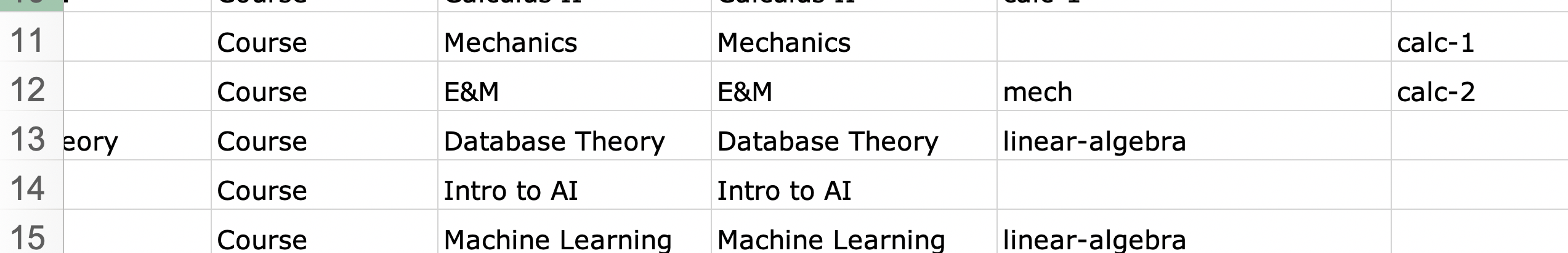
By starting small, you're getting data to play around with and do something with. Don't be afraid to be "wrong" — just get started and do it. At this stage, we recommend getting it done vs. getting it done "perfectly". If you're wondering how exactly to map, we have a sample Excel curriculum mapping template. (You don't have to use Rhumbl to use that template.)
Educational mapping needs visualization
Once you have a small set of data — around 50 entities and about that many relationships — it's time to make a visualization out of that data. You're probably wondering "why?". Because educational mapping requires leadership buy-in, and the easiest way to get leadership buy-in is to create something pretty and stunning to look at.
It's also good for you to visualize the fruits of your labor because it helps you pick out mistakes and edits you want to make.
So, what kind of visualization? Obviously, since we make network visualization software, we think that network visualization is the best way to visualize educational maps because network visualizations really showcase those relationships well. But other types of visualizations could work too: chord diagrams, Sankey charts, etc.
Get buy-in
When you have a pretty visualization, it's time to shop it around. Talk about it, schedule meetings to showcase it. Make presentations. This is the time to get buy-in from leadership and your colleagues. Because you'll need help in fleshing out the rest of the map.
At Rhumbl, we have tons of experience doing mapping within organizations. If you want to get our expertise consulting on a mapping project, email us at hello@rhumbl.com.